Below you'll see the artwork for 2025 and prior years, along with an explanation of each.
Artists:
- 2024-2025: David Cole & Josh Taylor
- 2023: Diana Witt
- 2017-2022: Kim Massey
- 2003-2016: Deanna Guyton
- 2022 - present: We are partnered with Richard Puckett at Progressive Graphics on Hillsborough St. in Raleigh
- Prior shirts were printed by Joel Tillotson at Ads in Action in Apex. Joel was a great partner but reached retirement in 2021.
2025
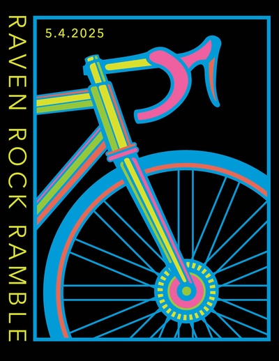
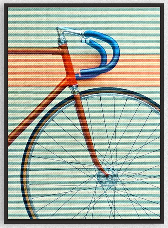
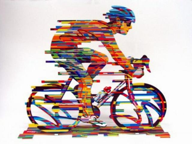
I found this image and thought it could work well as a starting point:
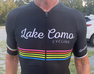
But, I wanted a current model bike (i.e., a Seven 622 SLX). I also had seen this jersey and really liked the color combinations:
I asked Josh at Progressive Graphics to combine these elements and add the typography. The result is a striking image worthy of hanging on a wall!
2024

I've always been impressed by the work of artist Ellsworth Kelly, and have a poster of Spectrum Colors Arranged by Chance from SFMOMA in my office. I wanted to do something with that, but I never knew what. Then I found his piece, Spectrum IV (see below), and decided that having vertical stripes as a background could make for an interesting effect, especially when combined with an op-art style such as what we used in 2019.
The result is visually striking, 'tho it may take a moment for the viewer to understand what they're seeing.
For the hat embroidery with lower resolution and less space, we simplified the design and removed the background.

Spectrum IV by Ellsworth Kelly:

2023
This design, developed by artist Diana Witt, used a metallic sculpture, shown below, as the starting point. I like the lines, the color, and the sense of motion. --DLC
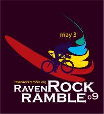
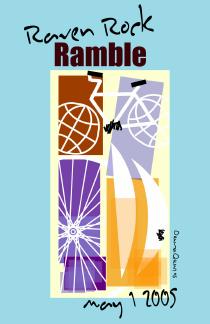
2022
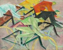
I've had a print of Lyonel Feininger's Bicycle Race hanging in my office for years and always wanted to use it. Artist Kim Massey was up to the challenge and developed this visually fascinating artwork for the 2020 Raven Rock Ramble. Since the 2020 event was cancelled due to COVID-19, this artwork gets passed forward to the 2022 event. --DLC
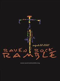
2021
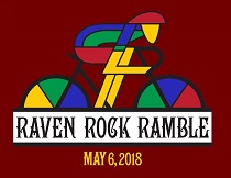
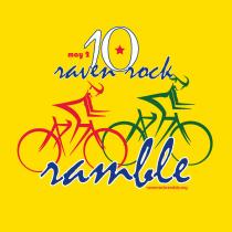
For the 20th Raven Rock Ramble I wanted to bring back the popular favorite we've used several times before, this time available in both Zorrrel quick-dry and Next Level cotton tees. --DLC
2019
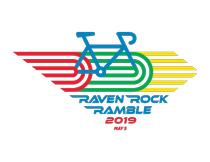
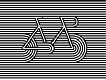
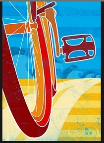
I was worried that last year's artwork was so good that it would be hard to top. But, I found this cool op art bicycle image, and Kim worked her magic to add color, typography and design elements to create the final piece. I love the colors and the sense of motion.
The tee shirts will be black, so the artwork will really pop. --DLC
2018
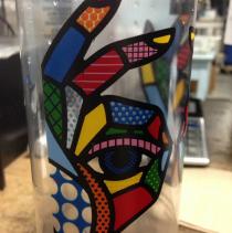
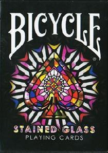
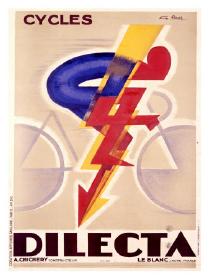
The initial inspiration came from a random photo I found online of a pint glass with a design that looked like stained glass. That got me searching for stained glass bicycle art, which yielded the Bicycle Playing Card image (I really like the font), and the Dilecta poster. Artist Kim Massey skillfully combined the three to create the resulting artwork. An astute cyclist will notice the palette of the world championship colors of blue, red, black, yellow, and green. Pretty cool, yes? --DLC
2017

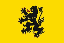
For years, riding partner Hal Drumheller has encouraged me to use artwork featuring the Flemish Lion. Artist Kim Massey took that idea and ran with it, yielding a stunning coat-of-arms type design, to be printed on a gray shirt. New for 2017 will be the option for men's and women's Gildan SoftStyle tees, as well as the usual Zorrell quick-dry tees. --DLC
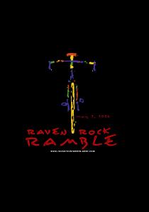
2016
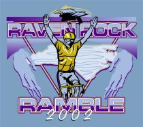
It's back! By popular demand the now-famous bicycle design that premiered in 2004 will make a repeat appearance in 2016. Of course, we'll still be using the Zorrel Boston and Zorrel Marathon quick-dry tees. --DLC
2015
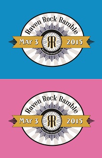
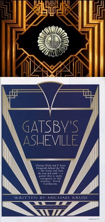
I was intrigued by the art deco designs shown in the opening and closing of the Great Gatsby, and similar designs.
Deanna replaced the "JG" with an "RR" inside a bike wheel, and developed a design around it. For added color, the men's tee will be printed on a bright blue Zorrel Boston crew neck shirt, and the women's tee will be printed on a bright pink Zorrel Marathon v-neck shirt. --DLC
2014
Deanna again developed an image and typography that pops brightly.
The 2014 artwork will be printed on navy blue Zorrel quick-dry shirts, available in both men's and women's cuts. --DLC
2013
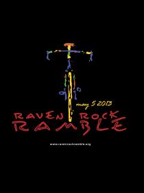
We're using the ever-popular bicycle design again for 2013, printed on black Zorrel quick-dry tees, and for the first time, available in women's cut v-neck sizes. --DLC
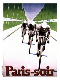
2012
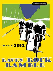
We started with classic cycling jerseys and artwork and settled on the image on the right. Deana developed the graphic to make it printable and added the typography and other elements. The tee shirt will be the same bright yellow Zorrel quick-dry shirt we used in 2010. --DLC
2011
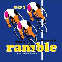
Deanna originally developed this idea as a candidate in 2010 and then we refined for 2011. The tee shirt will be a bright royal blue Zorrel Boston quick-dry. --DLC
2010
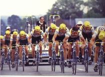
An old team time trial photo suggested by Kevin Jayes was the starting point for 2010. The riders are (subtly) male and female. The tee shirt will be bright yellow, in choice of Hanes Beefy-Y or Zorrell Boston quick-dry. Think of it as your own yellow jersey! --DLC
2009
The 2009 artwork was inspired by a poster I saw in Pittsburgh. The tee shirt will be black. --DLC
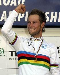
2008
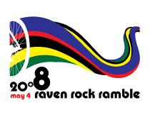
The artwork for 2008 is derived from the world champion stripes (see Tom Boonen, below), curving like a twisting road. The shirt color will be Ice Gray. --DLC
2007
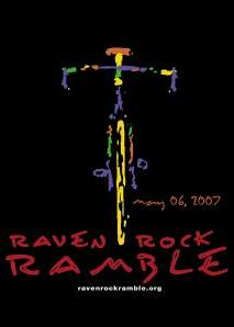
By popular demand I'll be re-printing the 2004 shirt, updated for 2007. While everyone seems to have their favorite, the 2004 artwork has been very popular. --DLC
2006
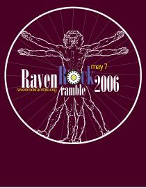
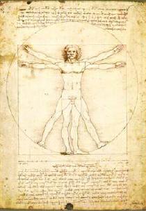
The inspiration for the 2006 artwork is the well known "Vitruvian Man" drawing by Leonardo Da Vinci (below), with a 32-spoke, 3-cross laced wheel serving as the surrounding circle. I like the combination of body and bicycle imagery. --DLC
2005
Having learned in 2004 to let the artist do her work (that is, be unencumbered by my ideas), Deanna developed this design as Matisse inspired artwork. The curved bands on the lower right suggest a bicycle helmet, as viewed from above.
The shirt will be a Hanes Beefy-T. The Hanes color is called "Menthol" - what Deanna describes as a Caribbean green. --DLC
2004
The 2004 design was entirely Deanna's doing, and much more interesting than what I had suggested. --DLC
2003
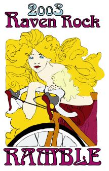
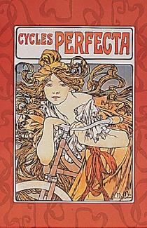
The Art Nouveau style of the 2003 design was based on the classic cycling poster below. The big difference is that bicycle was replaced by a Trek 5500. --DLC
2002
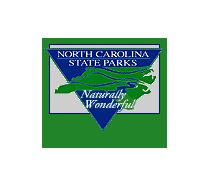
The graphics for the inaugural ride were developed by Chris Cartledge of Clemson, SC. The design was based (loosely) on the NC State Parks logo, below. --DLC
 Just a moment...